10 of the Best Charity Websites in the UK (2026, Every One Checked)

By Nick Croce
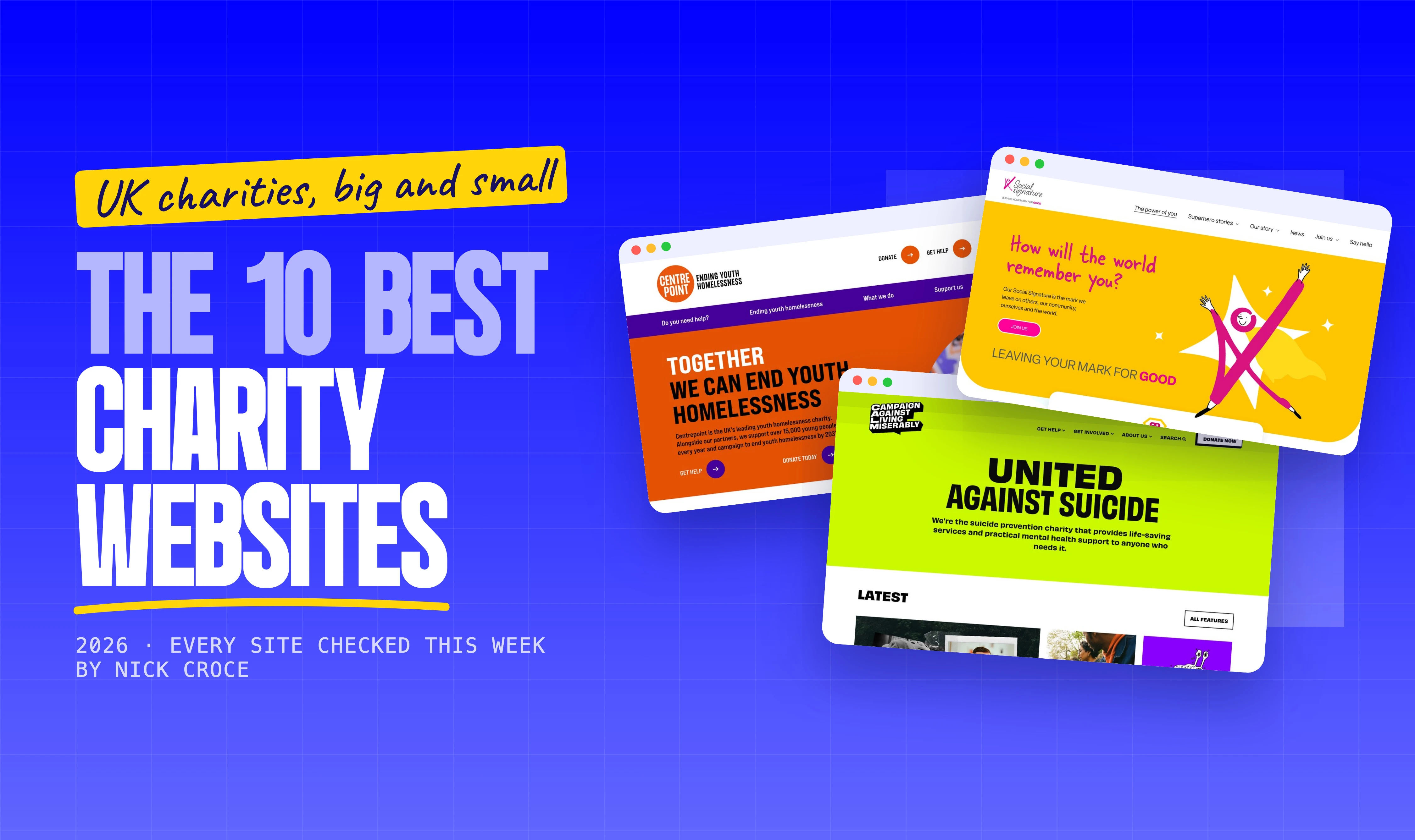
Every “best charity websites” list I’ve found is a wall of American nonprofits and a screenshot from three years ago. This one is UK charities only, I loaded every site this week, and the screenshots are what you’d see today. Big names and small ones, because a six-figure design budget isn’t the thing that makes these good.
One of the ten is mine, a Liverpool charity, and I’ve said so where it appears. The other nine I have no connection to; I picked them because they look designed rather than assembled, and because each one does something a charity website is supposed to do better than almost anyone else. Where a site credits its designer I’ve named them; most don’t, so I haven’t guessed.
If you run a charity and you’re here for ideas, read the “what to steal” line under each one. If you’re here because your own site is embarrassing you in front of funders, that’s the job I do.
| # | Site | What it does best | Platform |
|---|---|---|---|
| 1🏆 | CALM | Help first, and a brand you can’t mistake | Craft CMS |
| 2 | Movember | One campaign, one screen, black | Next.js |
| 3 | Social Signature | One colour at full volume | Squarespace |
| 4 | Centrepoint | Two doors: I need help / I want to support | Drupal |
| 5 | Teenage Cancer Trust | Placard headlines over real patients | Not stated |
| 6 | Amnesty International UK | Petitions as headlines, black and yellow | Not stated |
| 7 | Dogs Trust | A named dog, not a statistic | Gatsby |
| 8 | Woodland Trust | A season as the hero, find a wood near you | Umbraco |
| 9 | Alzheimer Scotland | Help in the hero, not behind a menu | WordPress |
| 10 | Scouts | A brand with energy, built around “where’s my nearest?” | Not stated |
The 10 best charity websites in the UK
1. CALM (Campaign Against Living Miserably)
Built by: no design credit on the site; it runs on Craft CMS.
Worth a look:
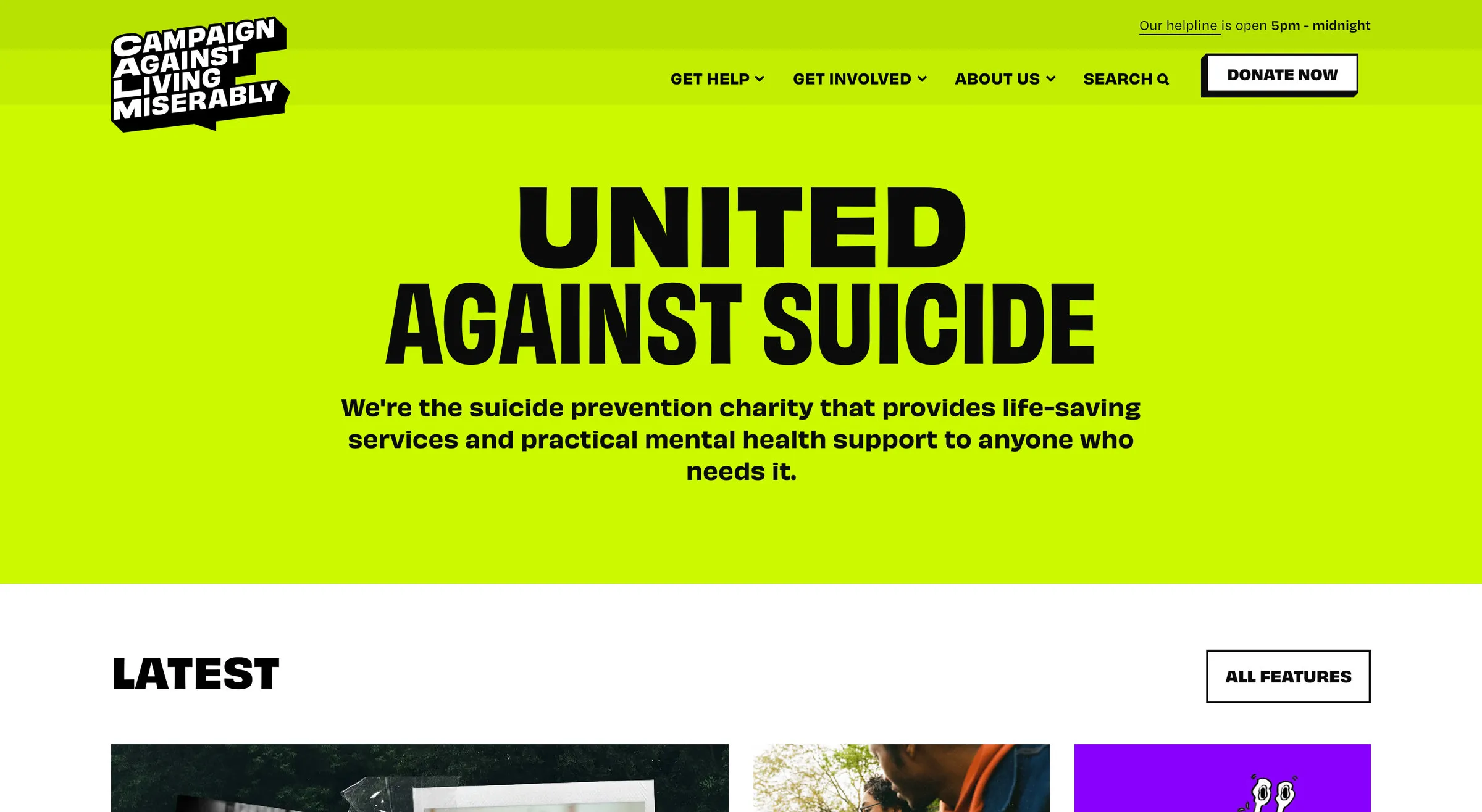
- Get Help is the first item in the navigation, before Get Involved and Donate, and the helpline’s hours sit in the top bar.
- “I’m finding things tough”, “I feel suicidal”, “I’m worried about someone”: the help menu is written in the visitor’s own words, not the charity’s departments.
- A brand you could spot from across the room: one green, one black, one condensed typeface, used everywhere.
- A “Latest” strip of features right under the hero, so the site reads like a magazine rather than an annual report.
CALM is the suicide prevention charity, and the homepage says exactly that in four words you can read from the other side of the room. What impressed me is the order of things: someone in a bad place gets the helpline and a menu in plain language before anyone asks them for money. The design is loud, which is a choice, and it works because every page keeps to the same two colours and one typeface.
What to steal: write your help menu in the words someone would actually type into Google at 2am. “I’m worried about someone” beats “Support services” every time.
2. Movember
Built by: no design credit on the site; built on Next.js. Movember Europe is the UK arm of the men’s health charity.
Worth a look:
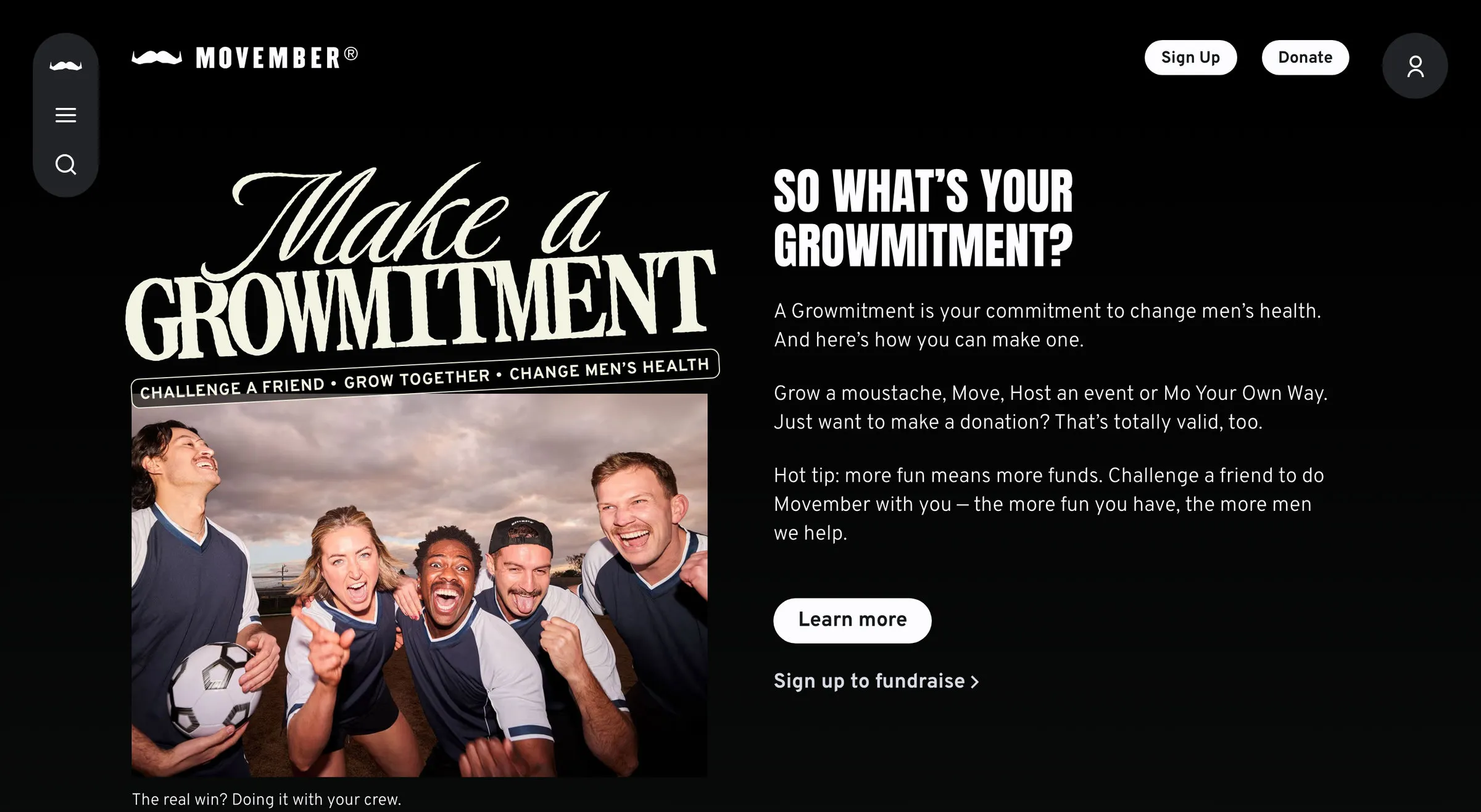
- The whole first screen is one campaign, with one headline, one explanation and one button. No carousel, no three columns.
- Dark background, big type: it looks like a sports brand because its audience follows sports brands.
- Sign Up and Donate are the only two buttons in the header. Everything else is behind the menu.
- Get Help has its own section further down for men who came for support rather than to fundraise.
Movember is the clearest example here of restraint. A charity with a dozen programmes, a shop, events and research chose to put one idea on the homepage and trust visitors to scroll. The type is enormous, the palette is black and white, and the single call to action is impossible to miss.
What to steal: one idea per screen. If you can’t say what the visitor should do next in one button, the page isn’t finished.
3. Social Signature
Built by: Design by Ency (that’s me), for a Liverpool charity, the Windmills Foundation’s Social Signature programme, in two weeks on Squarespace. The small one on this list, and the only one I’m biased about.
Worth a look:
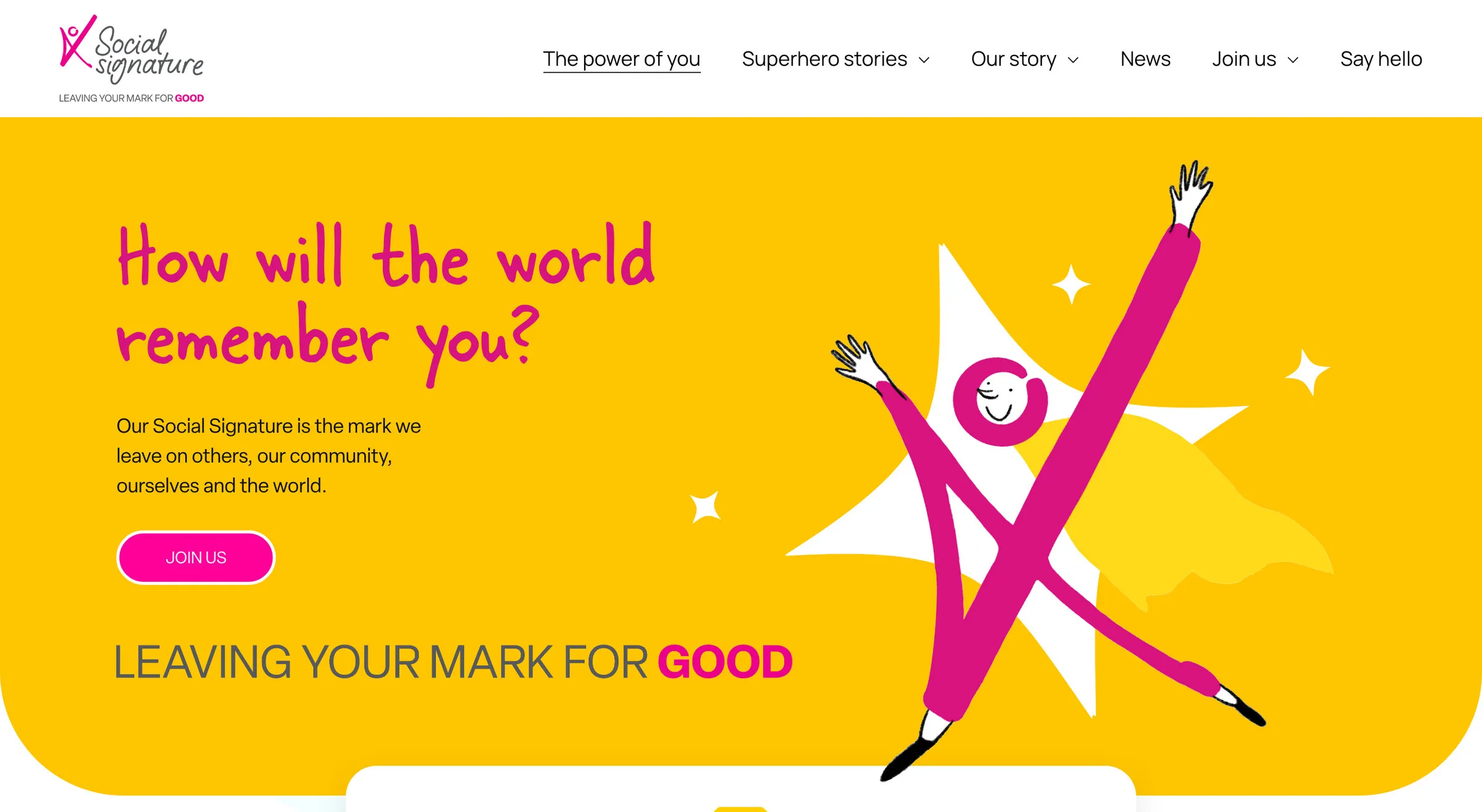
- A question as the headline: “How will the world remember you?” rather than a statement about the charity.
- One colour used at 100% of the screen, not as an accent. You know whose site you’re on from the first pixel.
- Superhero Stories: a set of trading-card style profiles that make the programme’s young people the heroes, literally.
- A resource library of videos and downloads for schools and community partners, which is what the charity actually needed the site to do.
Social Signature is about the mark you leave on other people, and the site had to feel like that rather than like a brochure. Two weeks from first call to launch, on budget, and warm enough to bring in new schools and supporters. It’s here to show that a small charity with a clear idea can look as considered as the national ones above it.
What to steal: if your charity has a proper brand colour, commit to it. Half the sites that look generic are using their colour at 10%.
4. Centrepoint
Built by: no design credit on the site; built on Drupal. Centrepoint is the UK’s leading youth homelessness charity.
Worth a look:
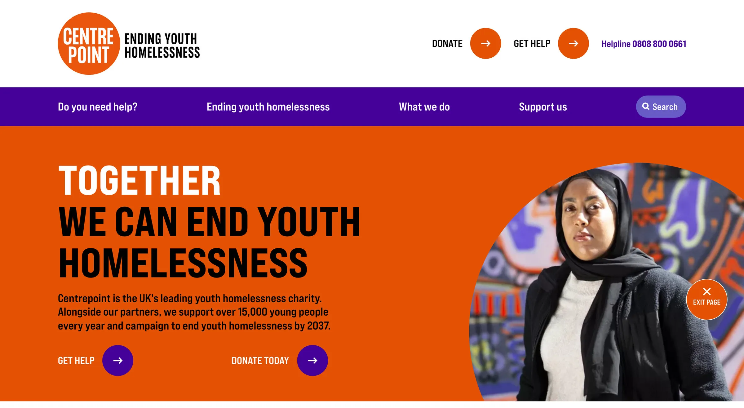
- “Do you need help?” is the first item in the navigation, and the helpline number sits beside the Donate and Get Help buttons.
- I NEED HELP… and I WANT TO SUPPORT… are the two cards straight under the hero. Every visitor is one of those two people.
- An Exit Page button for anyone who needs to leave quickly.
- Orange and purple at full strength with condensed capitals. It doesn’t look like a council leaflet, which is the trap for a housing charity.
A charity website usually has two audiences with nothing in common: people who need the service and people who might pay for it. Centrepoint splits them in the first screen with two big cards and routes each one onward. The headline is a sentence anyone can repeat, and the orange is used with real confidence.
What to steal: if you serve two audiences, give each a door on the homepage with their own words on it, and never make the person in need hunt past the fundraising.
5. Teenage Cancer Trust
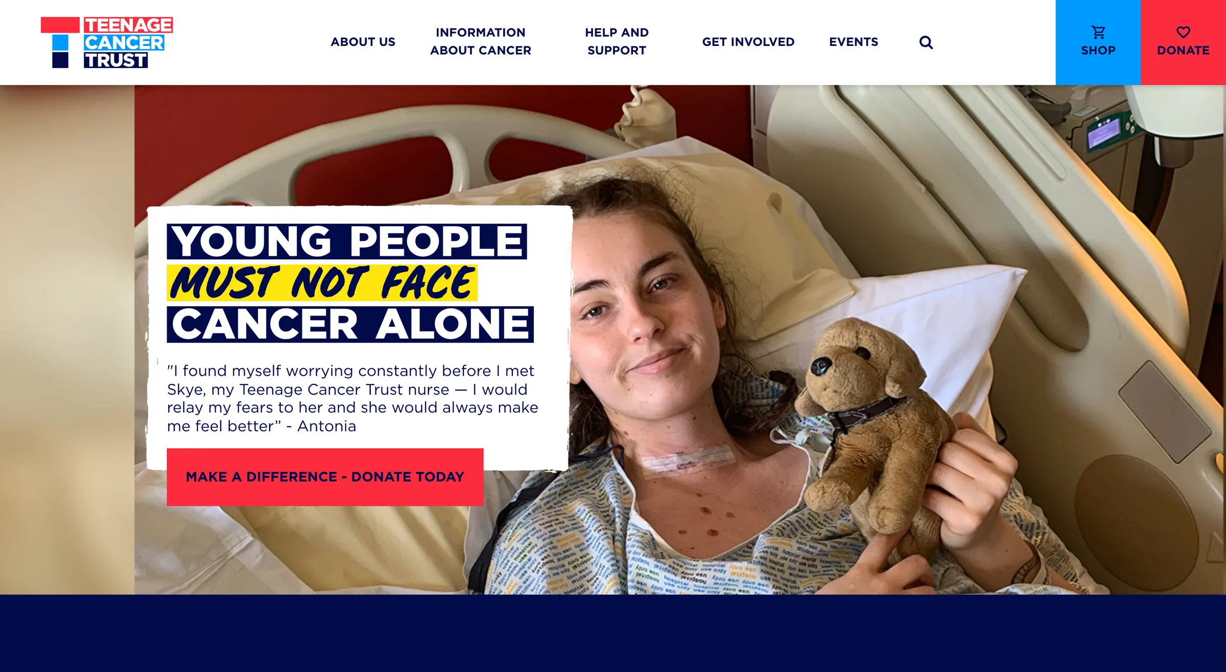
Built by: credited in the footer to Numiko, the Leeds agency. Teenage Cancer Trust is the charity for 13 to 24-year-olds with cancer.
Worth a look:
- The headline is set in white boxes over the photo, one phrase per box, so it reads like a placard rather than a caption.
- A real young person and a real quote in the hero, about the nurse who helped her, instead of a stock image.
- Shop and Donate are two coloured squares fixed to the right of the header, impossible to miss and out of the way of the menu.
- “I think I have cancer” and “I’ve got cancer” are menu items. The information section is organised by the reader’s situation, not by the charity’s departments.
This is what a bold charity homepage looks like when the subject is serious: the type is loud, the photo is honest, and nothing is softened into pastel. The stories further down use the same boxed headline treatment (“I suffered with symptoms for a year”), so the whole site has one voice.
What to steal: set your headline like a placard. Short phrases in solid boxes over a photograph read from across the room and survive any image behind them.
6. Amnesty International UK
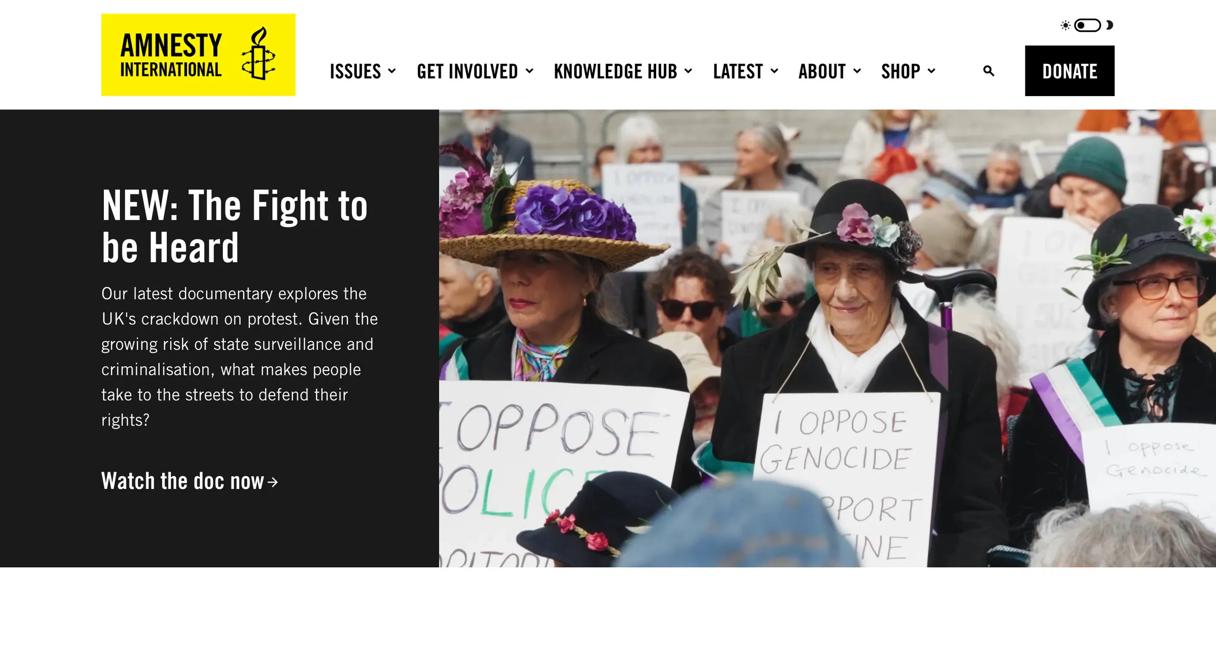
Built by: no design credit on the site. Amnesty International UK is the UK section of the human rights movement.
Worth a look:
- Black and yellow and nothing else. The brand colours do all the work; there isn’t a soft tint anywhere on the page.
- Petitions written as headlines: “End the prosecution of peaceful protestors”, “No Palantir in our NHS”. Each one is an action, not a topic.
- Issues is the first item in the navigation, listed by what’s happening in the world rather than by what the organisation does.
- A documentary as the hero, with “Watch the doc now” as the call to action. Campaigning charities can lead with content.
Amnesty’s site treats the visitor as someone who wants to do something today. The homepage is a list of things you can sign, watch and read, in a hard black-and-yellow palette that hasn’t changed in decades because it doesn’t need to. It looks like a newspaper front page run by activists, which is right.
What to steal: turn your campaigns into imperative sentences. “End the prosecution of peaceful protestors” gets a signature; “Our protest work” gets a scroll.
7. Dogs Trust
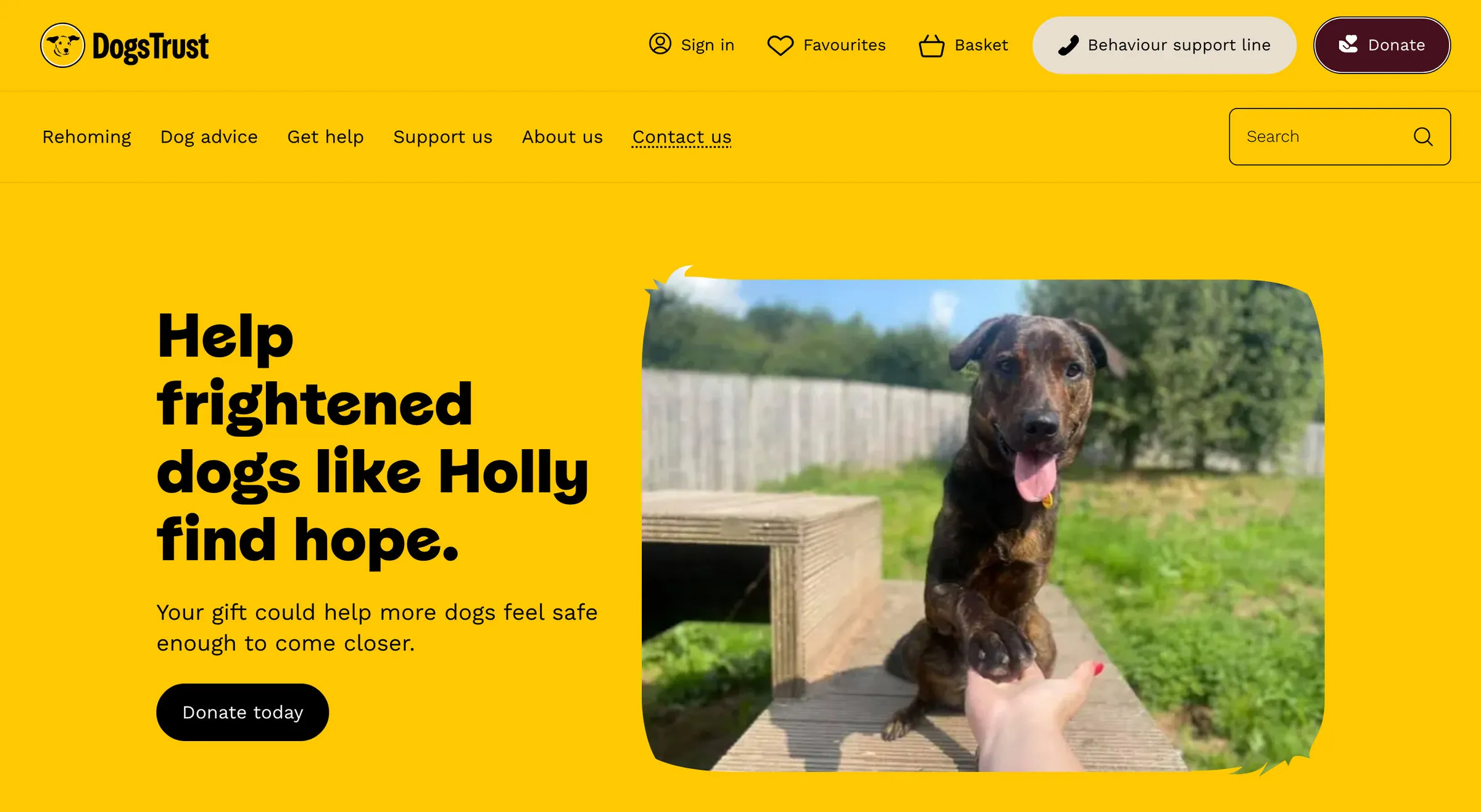
Built by: no design credit on the site; built on Gatsby. Dogs Trust is the UK’s largest dog welfare charity.
Worth a look:
- The hero is about one dog, Holly, not “thousands of dogs”. A name and a face beat a statistic.
- Find dogs to adopt is a live search with filters on the homepage, showing how many dogs are available right now.
- Rehoming is the first item in the navigation, before Support us, because that’s the charity’s job.
- Yellow, used properly: the whole hero, not a thin stripe.
A rehoming charity’s website is a product as much as a cause, and Dogs Trust treats it like one: search, filters, favourites, sign in. But the homepage still leads with one frightened dog and a plain sentence, which is the emotional front door the product needs.
What to steal: lead with one named person (or dog). Donors give to a story, then a cause, in that order.
8. Woodland Trust
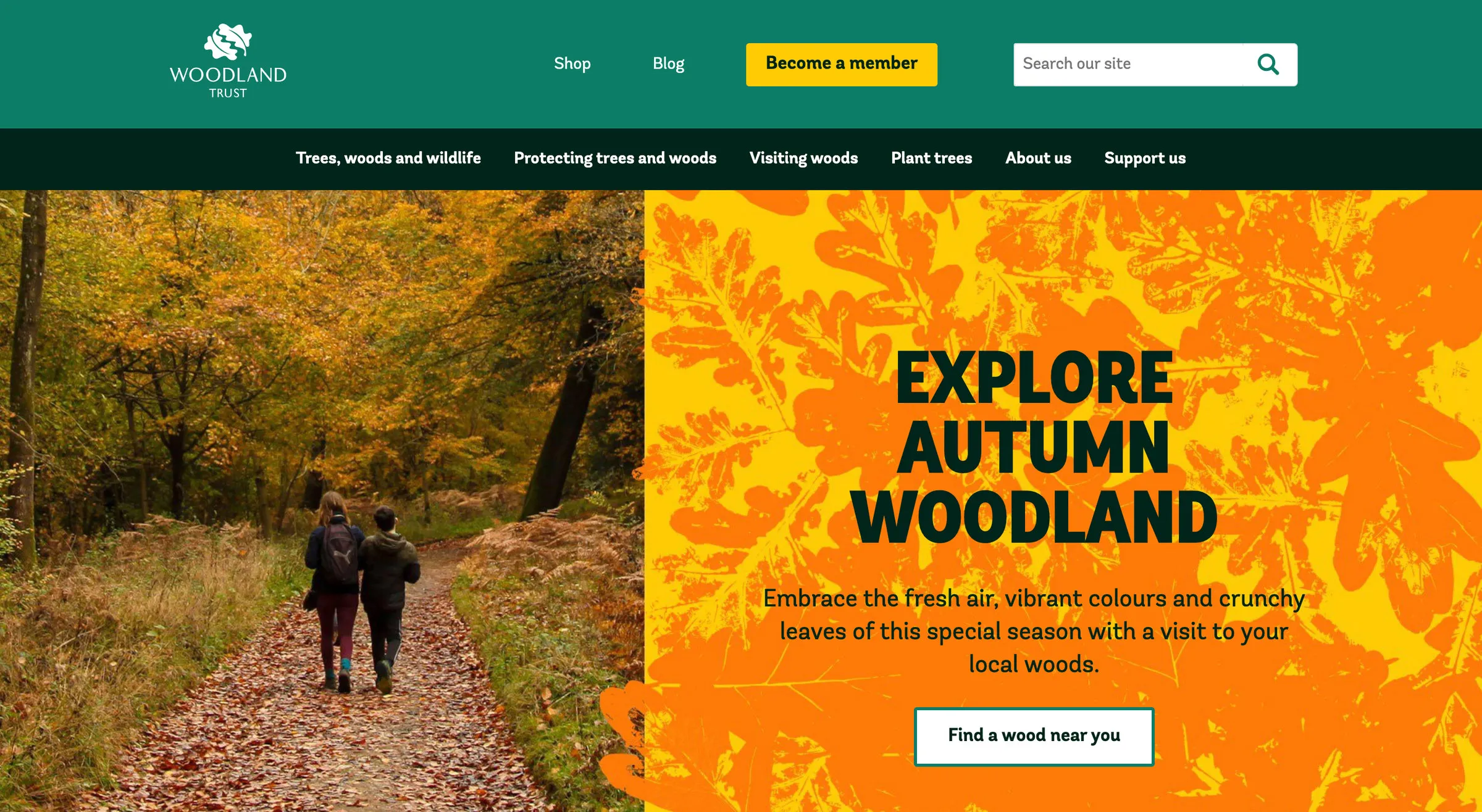
Built by: no design credit on the site; it runs on Umbraco. The Woodland Trust is the UK’s largest woodland conservation charity.
Worth a look:
- The hero changes with the season. This week it’s autumn woodland in orange; the whole first screen is one photograph and one invitation to go outside.
- “Find a wood near you” is a feature, not a page: the charity owns a thousand-odd woods and the site is how you visit them.
- Three huge numbers under the hero do the impact reporting in a glance.
- Become a member is the green button in the header, ahead of Donate, because membership is the model.
Most conservation charities show you a problem. The Woodland Trust shows you a wood and tells you how to get to it. The photography is doing the persuading, the numbers back it up, and the membership button is where the money comes from. It’s one of the warmest homepages on this list.
What to steal: if your charity has somewhere people can go, make “find one near you” the homepage’s job. Experience first, donation second.
9. Alzheimer Scotland
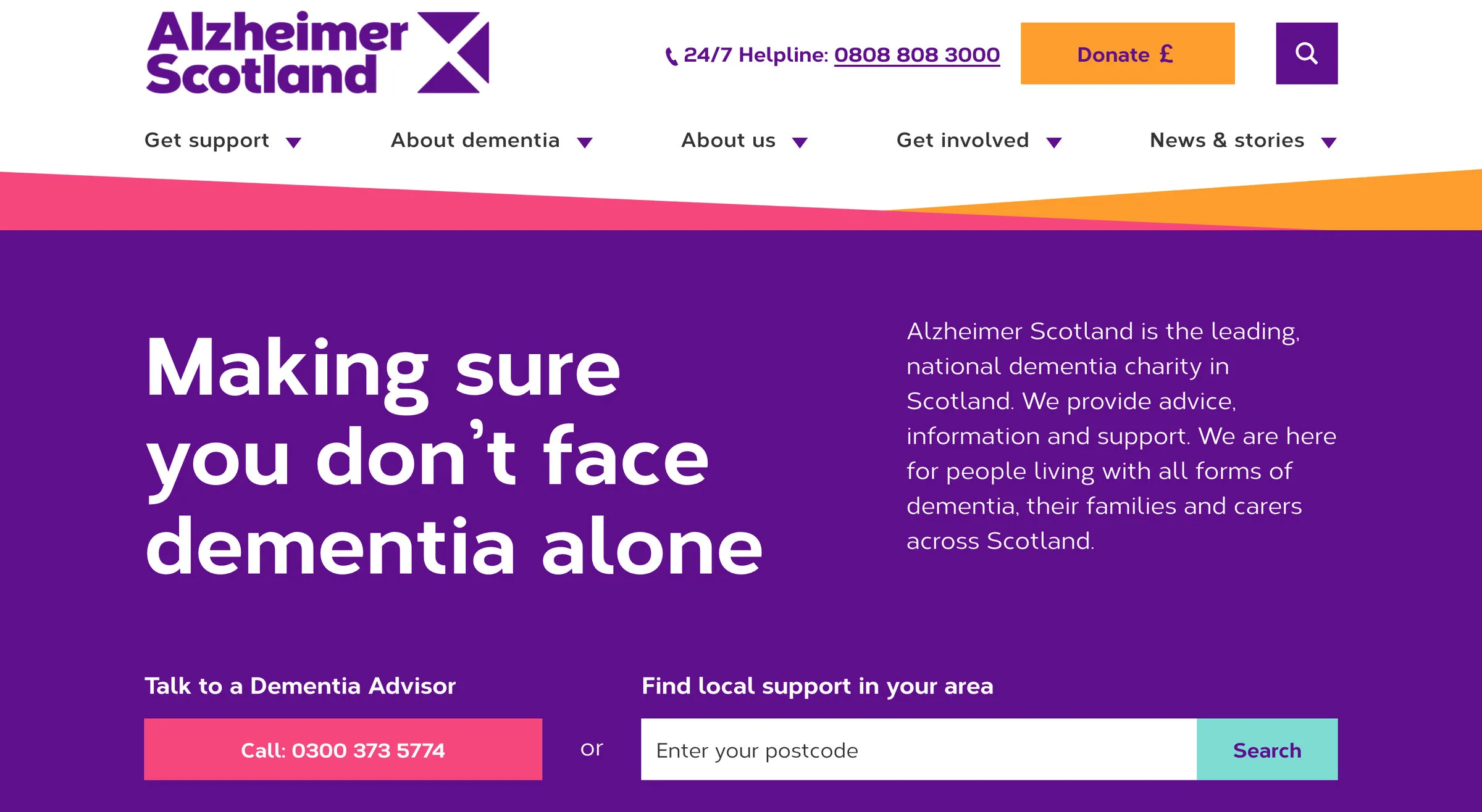
Built by: no design credit on the site; it runs on WordPress. Alzheimer Scotland is the national dementia charity for Scotland.
Worth a look:
- The 24/7 helpline number is the first thing in the header, before Donate.
- Talk to a Dementia Advisor sits in the hero itself: a phone button and a postcode search for local support, side by side.
- “I have dementia” and “Information for carers and families” are the two headings straight after the hero, so each reader finds their own door.
- One strong purple with an orange wave under it. Against the pale blues most health charities default to, it’s unmistakable.
Dementia charity websites tend to be gentle to the point of vanishing. Alzheimer Scotland’s isn’t: the headline is a promise, the colour is confident, and the two things a worried visitor actually needs, a person to talk to and help near them, are in the first screen. The donation amounts further down (£10, £50, £100) each come with a reason.
What to steal: put the help in the hero, not behind a menu. A phone button and a postcode box above the fold do more for a support charity than any amount of copy.
10. Scouts
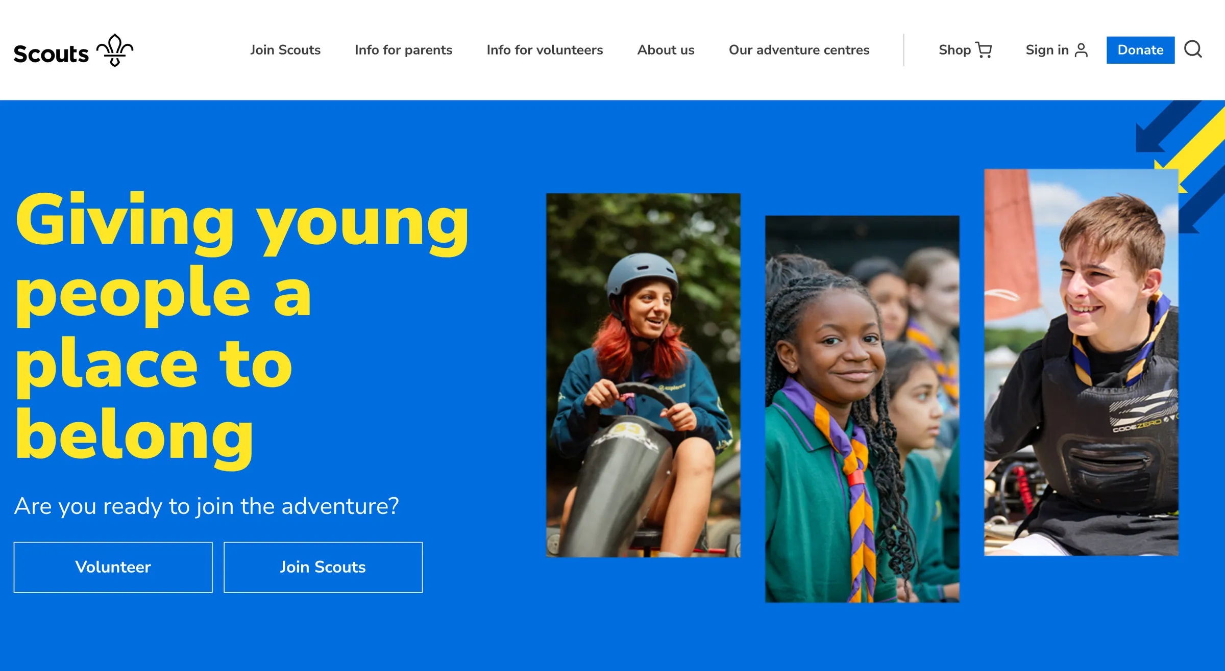
Built by: no design credit on the site. The Scouts is one of the UK’s largest youth charities, with 306101 and SC038437 as its charity numbers in the footer.
Worth a look:
- Blue, yellow and angled photo cut-outs. The 2018 rebrand still looks fresher than most charity sites launched last year.
- “Giving young people a place to belong”, one line, then two buttons: Volunteer and Join Scouts. Both audiences served in one screen.
- The age groups are the navigation: Squirrels, Beavers, Cubs, Scouts, Explorers, Network, each with a one-line promise, so a parent finds the right one instantly.
- Find your local group with a “use your location” button. The site’s real job is getting people to a Tuesday night in a hall, and it knows it.
The Scouts site is what a membership charity should look like: a brand with real energy, one sentence that explains the whole organisation, and a structure built around the question every visitor has, which is “where’s my nearest one?” Nothing on the homepage is there for the charity’s benefit; it’s all for the parent, the volunteer or the young person.
What to steal: organise the homepage around the visitor’s first question. For Scouts it’s age and location; for you it might be “do you cover my area?” or “can you help with this?” Answer it before you say anything about yourselves.
What the best charity websites have in common
Ten sites, budgets from a fortnight’s work to a national campaign, and the same five decisions:
- Help comes before money. CALM, Centrepoint, Teenage Cancer Trust and Alzheimer Scotland all put the person who needs the service first in the navigation. The donate button is still there; it just isn’t in the way.
- One idea per screen. Movember, Woodland Trust and Scouts each give the first screen a single job. None of them has a carousel.
- The visitor is named. “I need help”, “I want to support”, “I think I have cancer”, “I’m worried about someone”. The best sites talk to one person at a time.
- Specific asks. £10, £50 or £100, each with a reason. Become a member. Sign this petition. Join your local group. Vague generosity doesn’t convert.
- A brand at full volume. CALM’s green, Centrepoint’s orange, Amnesty’s yellow and black, Social Signature’s yellow. The generic charity look comes from being timid with a perfectly good colour.
None of this needs a national charity’s budget. It needs someone to decide what the homepage is for and then stop adding things to it. If you want the full list of what I build into a charity site, from donations to accessibility, it’s on the website design for charities page.
Questions people ask
What platform should a charity website be built on?
The ten above run on at least six different platforms, from Squarespace to custom code, and you can’t tell from the front. The platform matters for who updates the site and what it costs to run, not for how good it looks. For most small and medium charities a well-built Squarespace site is the right call because your own team can run it; large charities with developers on staff tend to build in code. Pick the one your team can actually maintain.
How much does a charity website cost in the UK?
Agencies that specialise in the sector typically quote £5,000 to £15,000 for a site like the smaller ones here, and the national charities above will have spent many times that. My custom builds for charities start from £3,000, or the Managed-For-You plan is from £150 a month with the build included. Every price is fixed in writing first; the full breakdown is on the pricing page.
What should a charity homepage have on it?
A way to get help (if you offer a service), a donate button that works on the first click, one current campaign or ask, proof of impact in numbers or one named story, and a navigation written in the visitor’s words. The sites above that do all five are the ones that feel effortless.
Do charity websites have to be accessible?
Public sector bodies have a legal duty; charities generally don’t have the same statutory one, but the Equality Act applies and, more to the point, your service users are often the people accessibility exists for. Proper colour contrast, alt text, keyboard navigation and headings in order are the minimum, and they’re the same things Google rewards.
Can you build my charity something like these?
That’s the job. One of the ten is mine, and the portfolio has three more charity and church sites. Start with the charity website design page, or book a call and tell me what the site needs to do.