10 of the Best Squarespace Websites in the UK (2026, Every One Checked)

By Nick Croce
Every “best Squarespace websites” list I’ve read is the same twenty American sites, screenshotted once in 2022 and never checked again. So here’s a different one: UK and Irish sites, picked by a UK designer, every one checked this week to confirm it’s actually still on Squarespace (two of last year’s award winners have already moved off it, so they’re out), with who built it and a note on what you can steal.
Three of the ten are mine, and a fourth is from down the road in Liverpool. I’ve said so on each. The rest are by designers I rate, several from my list of the best Squarespace designers in the UK, plus one Qube Awards winner, which is the closest thing Squarespace has to an Oscar. My portfolio is over there if you want more of mine.
If you came here for Squarespace website inspiration, the point of the list is this: Squarespace is not the ceiling people think it is. Every site here runs on a normal Squarespace plan. The difference is the design, and in a few cases a bit of custom code.
| # | Site | Built by | Where |
|---|---|---|---|
| 1🏆 | Social Signature | Design by Ency (Nick Croce) | Liverpool, UK |
| 2 | The Electric Car Scheme | by Crawford (Sam Crawford) | UK |
| 3 | Humble Grape | SpaceWorks (Dylan Winn-Brown) | London, UK |
| 4 | Eddie Rocket’s | Vative Creative (Michael Brodzik) | Ireland |
| 5 | Alpha | Made by Dave (Dave Hawkins) | London, UK |
| 6 | Redefine | Redefine (in-house) | Liverpool, UK |
| 7 | Equality Leaders | NOCTURN Designs (Thatcham, UK) | London, UK |
| 8 | Black Acre | Design by Ency (Nick Croce) | Bristol, UK |
| 9 | Artorius | by Crawford (Sam Crawford) | UK |
| 10 | Crystal Vantage | Design by Ency (Nick Croce) | London, UK |
The 10 best Squarespace websites in the UK (and one from Ireland)
1. Social Signature
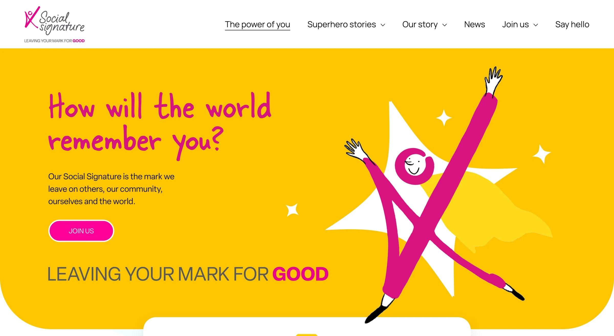
Built by: Design by Ency (that’s me), for a Liverpool charity, the Windmills Foundation’s Social Signature initiative, built in two weeks.
Worth a look:
- Superhero Stories: a set of trading-card style tiles (Charlie’s story, James’ story, Beth’s story, Class 5’s story, a whole school’s story), starting with Charlie in his cape and mask, each opening into its own page. “Click each card to learn more” is the whole instruction.
- Custom illustrated superheroes drawn for the brand, not stock icons, including the one flying across the hero.
- A video library and downloadable resources built into the site, so the charity’s films and toolkits live in one place.
- Built in two weeks, launch to live, on a charity budget.
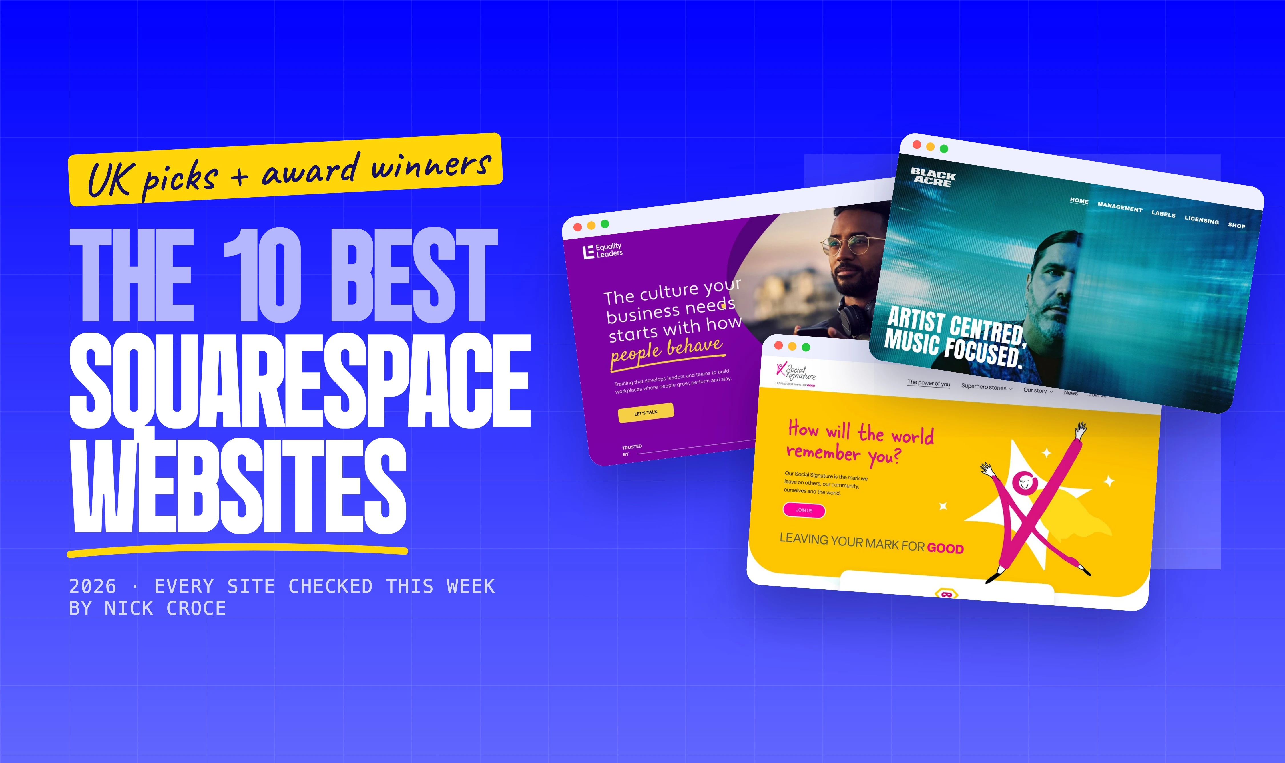
Social Signature is about the mark you leave on other people, and the site had to feel like that rather than like a grant application. It’s the most illustrated site on the list: custom characters, a hand-written headline, a yellow you can see from across the room. It also hosts their video content and downloadable resources, which is usually where charity sites get clunky.
What to steal: one bold brand colour used at 100% of the screen, not as an accent. And a question as the headline (“How will the world remember you?”) rather than a statement.
2. The Electric Car Scheme
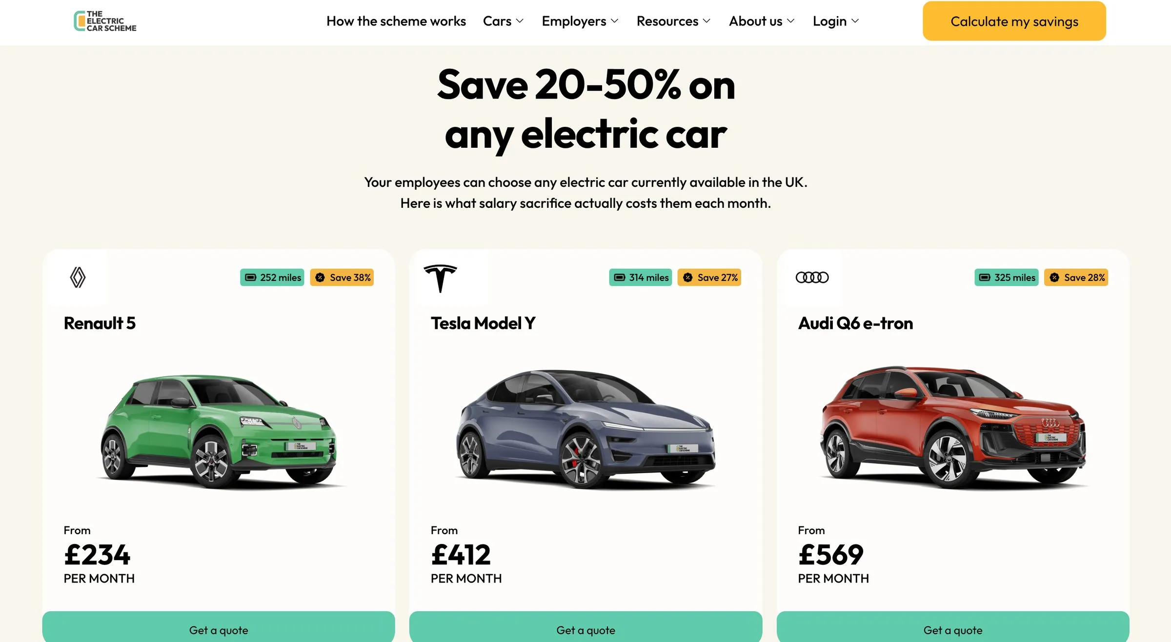
Built by: by Crawford, Sam Crawford’s studio in London. Image from Sam’s own case study.
Worth a look:
- Live car pricing on the homepage: real models with real monthly salary-sacrifice costs and a quote button under each.
- A “Calculate my savings” tool as the header button, so the main call to action is a calculator, not a contact form.
- Two audiences, one nav: drivers and employers each get their own route, plus a login for existing customers.
- Sam’s two-week performance pass stripped years of accumulated scripts so every ad click lands on a faster page.
The UK’s salary-sacrifice electric car company, on Squarespace, with the kind of conversion layout you’d expect from a software company: Trustpilot stars above the headline, one clear button, and then the actual cars with their actual monthly prices (a Renault 5 from £234 a month when I looked) and a quote button under each. Sam’s most recent work on it was a two-week performance pass, stripping years of accumulated scripts so the same site loads materially faster for every ad click, which is the least glamorous and most valuable thing you can do to a site that spends money on traffic.
What to steal: put the price on the homepage. If you can show what it costs, the people who click through are the people who can afford it.
Visit siteDesigner’s case study
3. Humble Grape
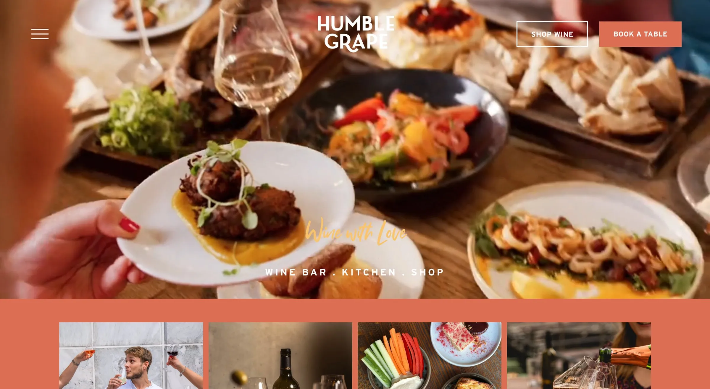
Built by: SpaceWorks, Dylan Winn-Brown’s studio, for a London wine bar group.
Worth a look:
- A page per venue with its own hours, menus, photos and local SEO, so each bar ranks for its own neighbourhood.
- Table bookings through OpenTable and a self-service events calendar the staff update themselves.
- Shop and bar in one: the online wine shop runs alongside the venues, with Shop wine and Book a table as the only two header buttons.
- Private dining enquiries handled as their own flow rather than a generic contact form.
A group of London wine bars, each with its own page, menus, hours and photos, plus an online wine shop, an events calendar and private dining enquiries, all on Squarespace. The header gives you exactly two choices, Shop wine or Book a table, and the bookings run through OpenTable. Dylan’s team built each venue its own page with its own local SEO, which is how you rank a multi-site business for “wine bar Battersea” rather than just the brand name.
What to steal: if your business has several locations, give each one a real page, not a tab on a map.
Visit siteDesigner’s case study
4. Eddie Rocket’s
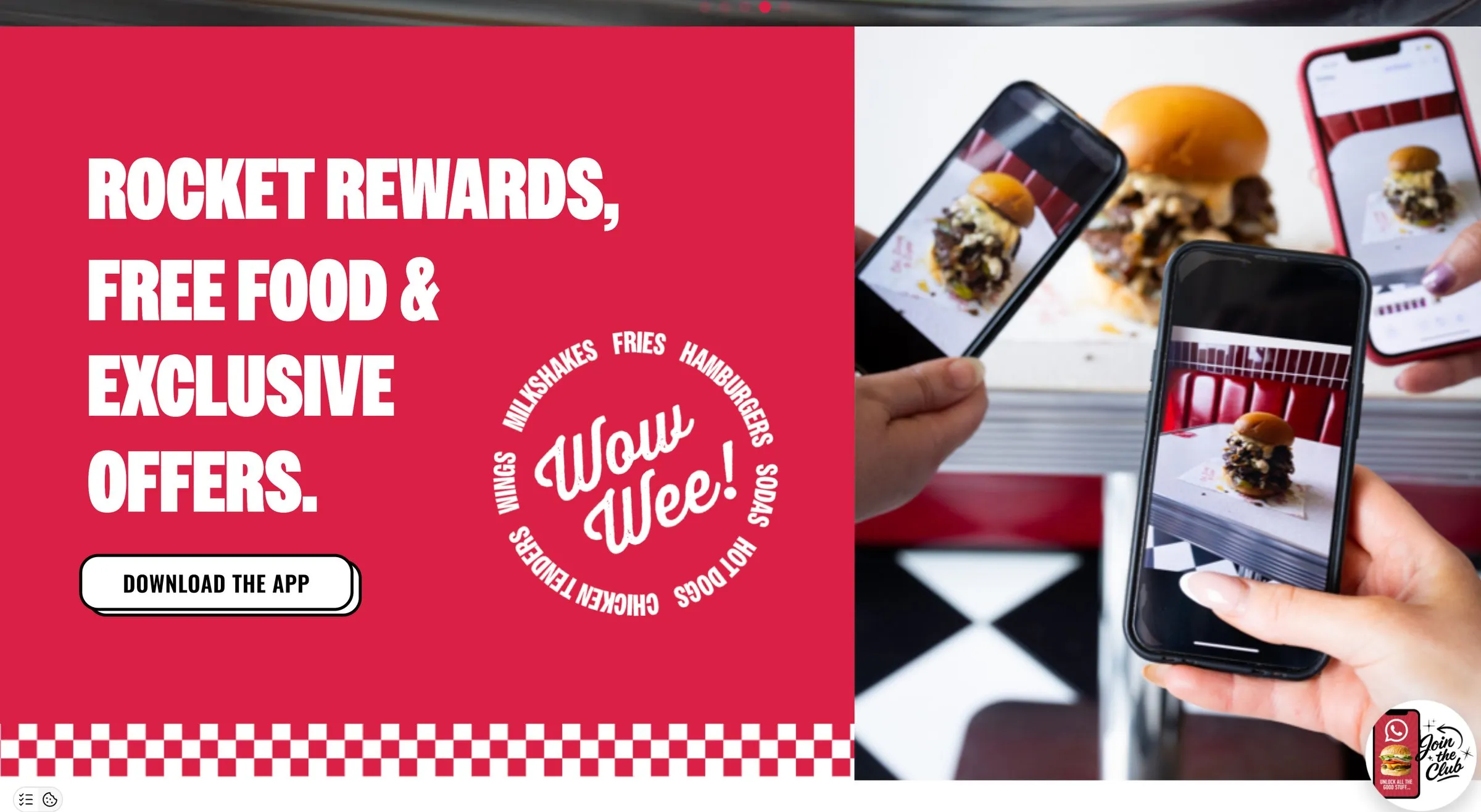
Built by: Vative Creative (Michael Brodzik), for the Irish diner chain. Featured on the Qube Awards.
Worth a look:
- Order Food as the first thing in the header, in a colour nothing else uses.
- Rocket Rewards: the loyalty app gets its own section, sold in diner red with a checkerboard, and a WhatsApp club sign-up.
- Limited-time offers with a live countdown in the announcement bar when I visited.
- Featured on the Qube Awards showcase in Food & Beverage.
Ireland rather than the UK, but close enough and too good to leave out. A national restaurant chain on Squarespace is rare, and Vative pulled it off by keeping the brand’s retro diner personality (the red, the chrome, the bold condensed type) while modernising everything around it. Order Food is the first thing in the header, and the loyalty app gets its own section further down, sold with the same red, the same condensed type and a checkerboard, rather than a banner nagging you on every page.
What to steal: if people come to your site to do one thing (order, book, buy), make that the top-right button and make it a colour nothing else is.
Visit siteDesigner’s portfolio
5. Alpha
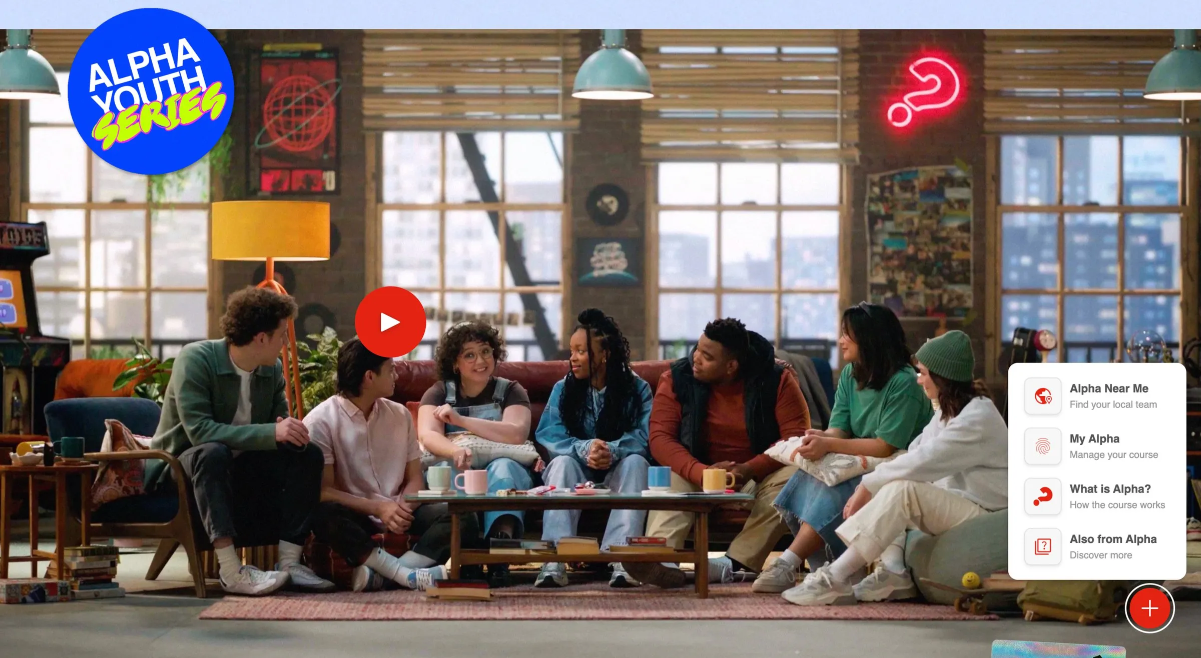
Built by: Made by Dave (Dave Hawkins), London, for Alpha, the course on the Christian faith that started at Holy Trinity Brompton and now runs worldwide.
Worth a look:
- Video first: the Alpha Youth Series gets a full-width player on the homepage.
- A floating four-route menu (Alpha near me, My Alpha, What is Alpha?, Also from Alpha) that sorts very different visitors without a wall of text.
- A language switcher in the header for an organisation that runs in more than a hundred countries.
- Run Alpha and Give as the two header buttons: the two things the organisation most needs people to do.
The biggest organisation on this list, and proof that Squarespace scales further than the “small business” label suggests. Alpha runs in over a hundred countries; the site has to work for a curious visitor, a church wanting to run the course, a volunteer and a donor, and it does it with video (the Alpha Youth Series gets a full-width player on the homepage), very little type, and a floating menu that offers four routes: Alpha near me, My Alpha, What is Alpha?, Also from Alpha. Dave has been building exclusively on Squarespace for a decade and it shows in how little is on the page.
What to steal: when you have many audiences, don’t put them all in the hero. Let a small menu do the sorting.
Visit siteDesigner’s portfolio
6. Redefine
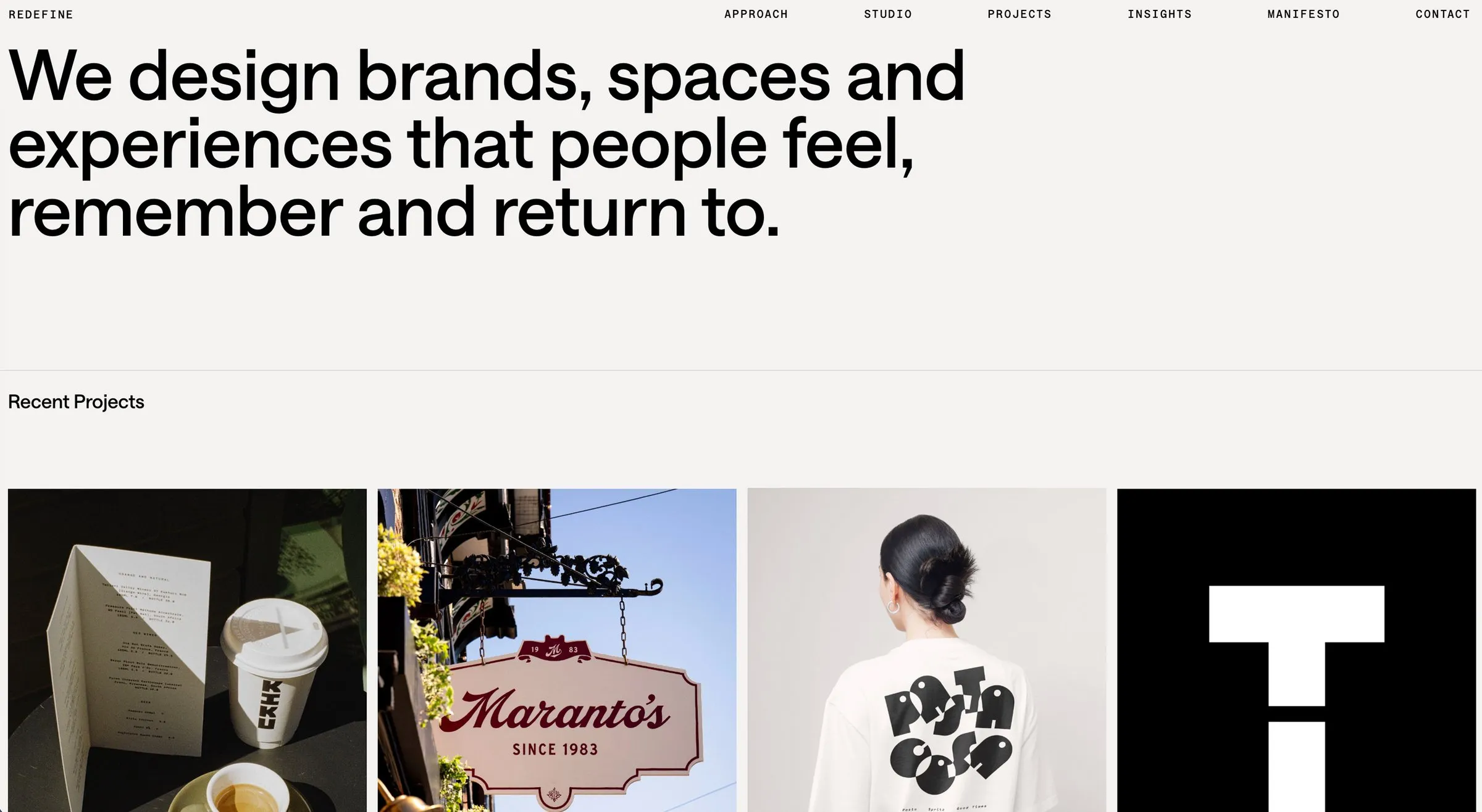
Built by: Redefine themselves, a Liverpool brand, design and interiors studio run by Tom and Georgia Woollam.
Worth a look:
- No hero image. The first screen is a single sentence (“We design brands, spaces and experiences that people feel, remember and return to.”) in a large grotesk on warm white, and nothing else.
- The work as the homepage: a tight grid of recent projects (Kiku Hifi, Maranto’s, Pasta Cosa, Suono, West Coast Coffee) with each one’s services listed as plain text, no card chrome.
- A manifesto page and a “7 Brand Senses” approach, which is the kind of point of view most agency sites are too cautious to publish.
- Mono-spaced uppercase navigation that stays out of the way of the type.
A Liverpool agency, so I’m biased, and one of the few agency sites I’d actually hold up as a model. Agencies tend to overdesign their own sites; Redefine did the opposite. The typography does all the work, the photography of real signage, menus and merch does the rest, and the whole thing feels like a well-set book rather than a website. It’s also a reminder that Squarespace handles an editorial, type-led layout as well as it handles the image-led ones.
What to steal: if your words are good enough, let them be the hero. One sentence, set large, says more than a stock photo with a headline over it.
7. Equality Leaders
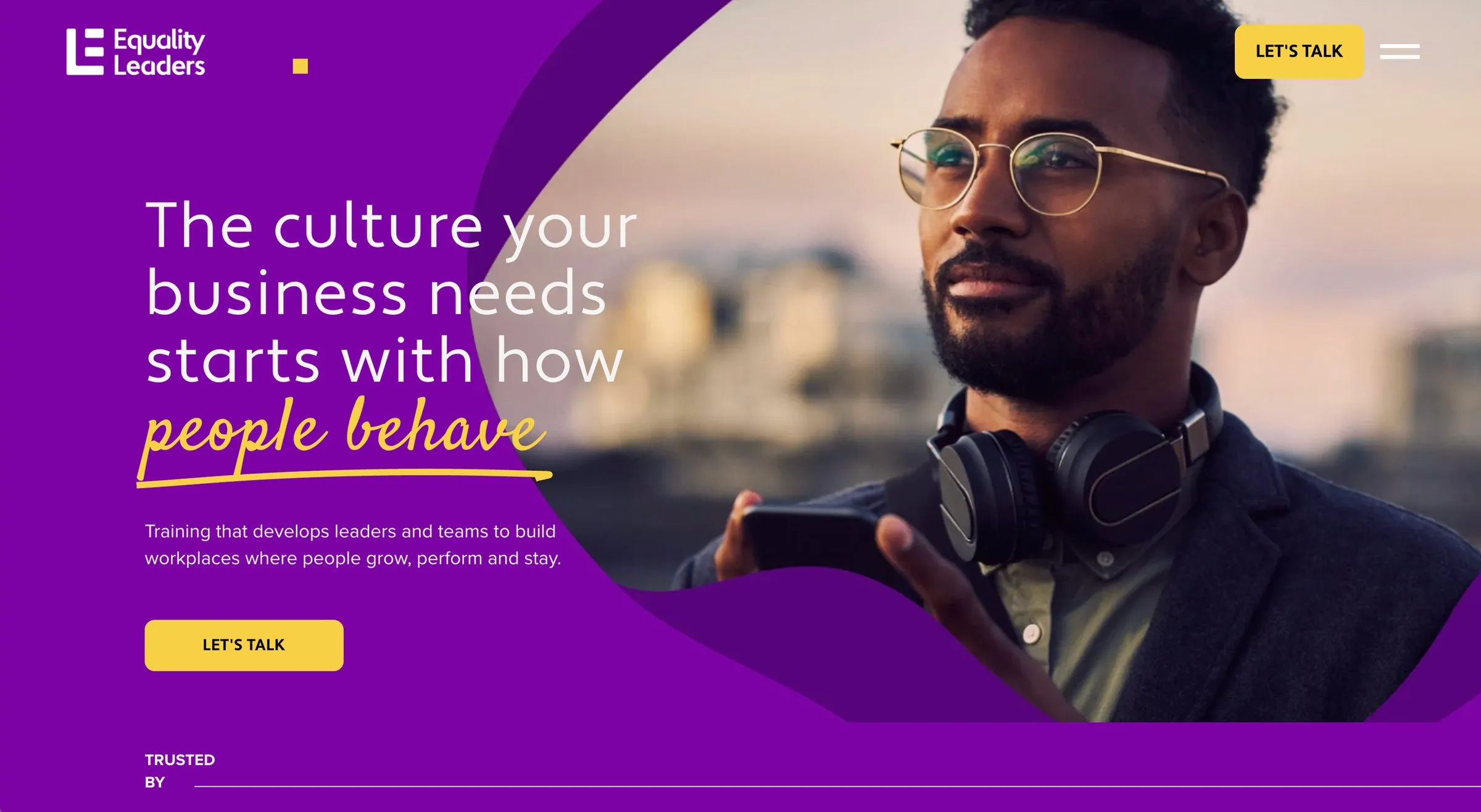
Built by: NOCTURN Designs, a Squarespace studio in Thatcham, Berkshire, for a London leadership and culture consultancy. Winner, Best Website Animations, Qube Awards 2025.
Worth a look:
- Purposeful animation: things move to direct your eye, which is what won it Best Website Animations at the 2025 Qube Awards.
- A hand-written highlight in the headline (“people behave”), the same trick I use on my own site.
- A “Trusted by” logo strip right under the hero, with Aviva, Asthma + Lung UK and the Royal Navy on it, so the proof arrives before the pitch.
A London leadership and culture consultancy with Aviva and the Royal Navy on its client list, and the bravest colour choice on the list: a saturated purple across the whole first screen, broken only by a portrait and a yellow button. The hand-written “people behave” in the headline is the same trick I use on my own site. The award was for the animations, which are purposeful rather than decorative: things move to direct your eye, not to show off.
What to steal: one unexpected colour, used without apology.
Visit siteDesigner’s portfolio
8. Black Acre
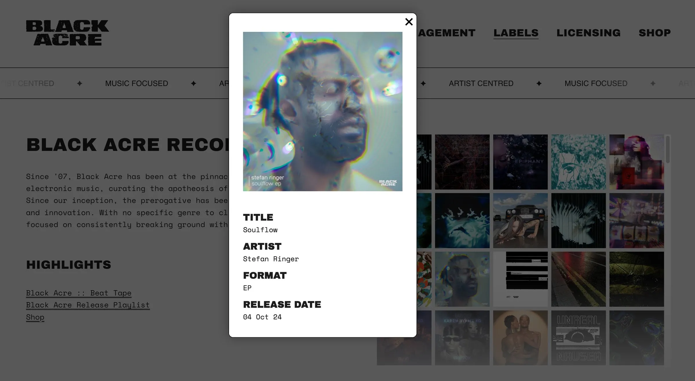
Built by: Design by Ency, for a Bristol record label and management company.
Worth a look:
- The record wall: hundreds of sleeves you can scroll through; click one and it opens with title, artist, format and release date. Custom code inside Squarespace.
- A marquee ticker (“Artist centred · Music focused”) running under the header on every page.
- A page per artist on the management roster, and a shop in the main navigation.
Black Acre has been releasing genre-defying electronic music since 2007 and wanted a site that felt like the label, not like a template. This is the most custom-coded site on the list. The Labels page is a wall of record sleeves you can scroll through, hundreds of releases deep; click one and it opens with the title, artist, format and release date. The whole site uses one heavy condensed face and a lot of black. It is still Squarespace underneath, which means the label updates the roster and the shop themselves.
What to steal: let the work be the decoration. If you have a hundred of something (records, projects, products), show the hundred.
9. Artorius
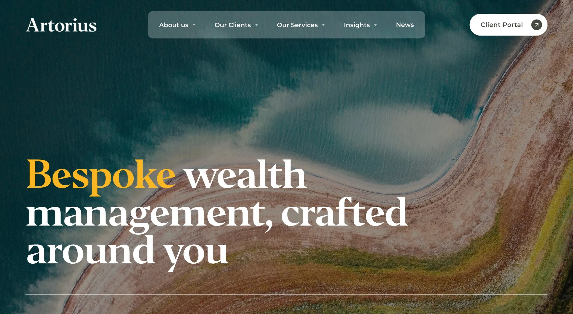
Built by: by Crawford, Sam Crawford’s studio in London, for a UK private-client wealth management firm, over eight weeks.
Worth a look:
- A client portal in the header, so existing clients log in from the same page that wins new ones.
- Navigation built around who you are: families and inter-generational wealth, private equity professionals, business owners, financial services professionals, sudden wealth. Each audience finds its own door.
- An Insights section with investment outlooks and commentary, which is what gives a firm like this authority with Google as well as with clients.
- Landscape photography instead of handshakes: an aerial coastline where every other wealth site has a man in a suit.
Wealth managers are the clients people assume need a bespoke build, and Artorius is the counter-example: a serious UK private-client firm on Squarespace, with a client portal, a structured services section and an insights library. The restraint is the design. One serif, one gold word in the headline, a pill navigation on a dark photo, and nothing shouting.
What to steal: name your audiences in the navigation. “Our Clients: business owners, families, professionals” does more selling than a page of adjectives.
Visit siteDesigner’s case study
10. Crystal Vantage
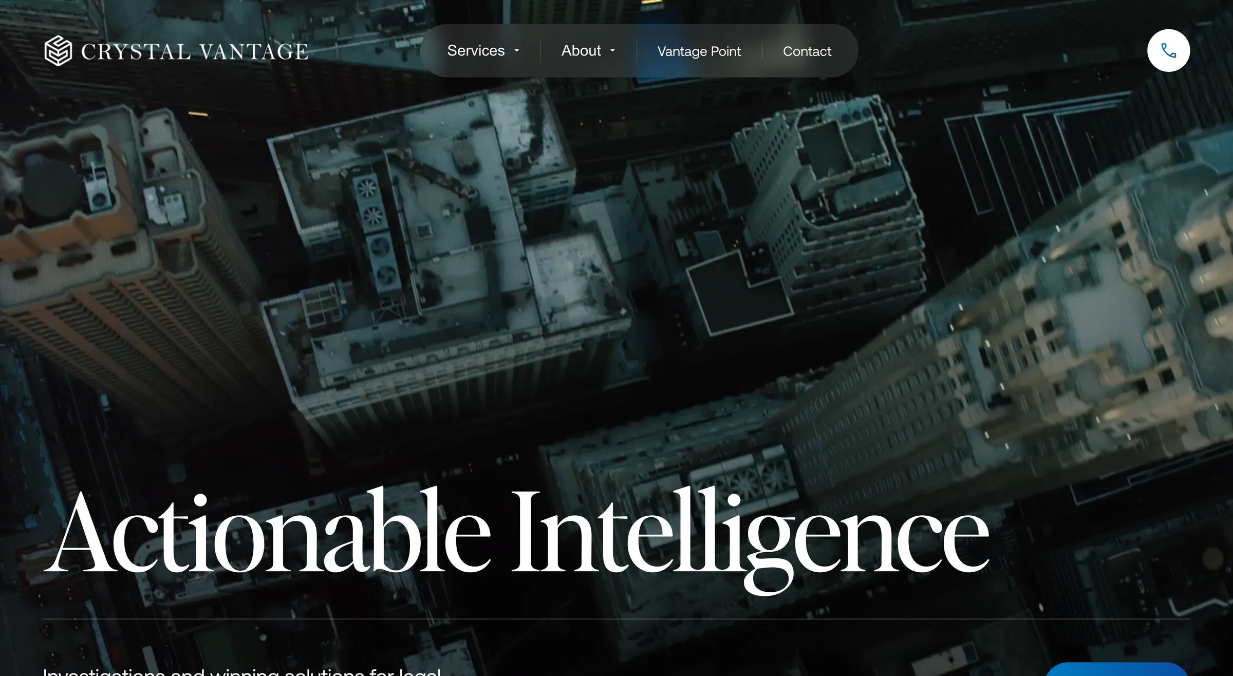
Built by: Design by Ency, for a London investigations and asset-recovery firm that works with law firms, over eight weeks.
Worth a look:
- Downloadable special briefings hosted on the site in their own section (Vantage Point), which is where the firm’s expertise actually shows.
- Consultation scheduling built in, so a lawyer can book directly rather than email and wait.
- A move off a clunky legacy platform onto Squarespace, with the content structure rebuilt rather than copied.
- A phone button pinned to the corner for the people who’d rather just call.
Crystal Vantage investigate and recover assets for law firms, which is about as far from a template-friendly business as you can get, and it’s one of mine. The brief was credibility: a dark, cinematic hero, a tall serif, the briefings front and centre, and an easy way to book a consultation. Custom code handled what Squarespace didn’t do out of the box, and the firm runs the site themselves.
What to steal: if your expertise lives in documents, give the documents a home on the site. A briefings library beats an “About us” page for proving you know your field.
What the best Squarespace websites have in common
Having looked at a few hundred of these over the years and picked ten, the pattern is consistent:
- One idea per screen. Every hero above has a headline (or a video), maybe one sentence, and one or two buttons. The sites that look “templatey” are the ones trying to say six things in the first screen.
- Real photography or real illustration. Not one of these ten uses a stock photo in the hero. That is the single biggest difference between a £29-a-month site that looks like it and one that doesn’t.
- Proof above the fold. Trustpilot stars, a “Trusted by” strip, real monthly prices. Put it where people see it.
- A brave colour. Purple, yellow, diner red, or Redefine’s warm white and nothing else. Squarespace sites look the same when everyone picks navy and white.
- Custom code only where it earns its place. Black Acre’s record wall and parts of Crystal Vantage are code. Almost everything else here is Squarespace’s own blocks, used well. You rarely need plugins; you need a designer who knows the editor.
If you want the full picture on what the platform can and can’t do, I’ve compared it with the alternatives in Squarespace vs Wix and Squarespace vs WordPress, and the cost guide covers what a site like these costs to build.
Questions people ask
Can a Squarespace website look custom?
Yes. Every site on this list runs on a normal Squarespace plan. What makes them look custom is design: real photography, a considered type pairing, a bold palette and restraint. Custom code adds specific features (Black Acre’s record wall) but it isn’t what makes a site look designed.
How do I find out who designed a Squarespace website?
Check the footer first; many designers credit themselves there (mine says “Website Design by Ency”). Otherwise, the Squarespace Marketplace and Circle member sites list designers’ portfolios, and most designers show their best work on their own sites, which is how I found several of these.
Do big organisations really use Squarespace?
Alpha runs in over a hundred countries, The Electric Car Scheme is a national company spending real money on ads, Eddie Rocket’s is a restaurant chain. All three are on Squarespace. The platform’s limit is complex custom functionality, not size.
Can you build me something like these?
That’s the job. Three of the ten are mine, and the portfolio has the rest. Custom Squarespace builds start from £3,000 and you own and run the site afterwards, or the Managed-For-You plan from £150 a month includes the build and looks after it for you.